dom(布局模块)

此模块定义了一组层次化的 ftxui::Element(元素)。元素管理布局,并且可以响应终端尺寸变化。请注意以下使用此模块创建简单布局并运用多个操作符的示例:
@subpage module-dom-examples 章节提供了一系列示例。
示例:
namespace ftxui {
    ...

// 定义文档
Element document = vbox({
  text("窗口") | bold | color(Color::Blue),
  gauge(0.5)
  text("页脚")
});

// 通过调用 `ftxui::border` 装饰器函数添加边框。
document = border(document);

// 使用管道操作符添加另一个边框。
document = document | border.

// 使用 |= 操作符添加另一个边框。
document |= border

...
}
元素列表
所有元素均已包含,可通过引入相应的头文件访问:
#include <ftxui/dom/elements.hpp>\include{strip} “ftxui/dom/elements.hpp”
文本
最简单的控件。它显示文本。
text("我是一段文本");我是一段文本。垂直文本
与 ftxui::text 相同,但垂直显示。
代码:
vtext("你好");终端输出:
你
好
段落
类似于 ftxui::text,但会根据容器的宽度将单个单词沿多行换行。
示例代码:
paragraph("一段很长的文本")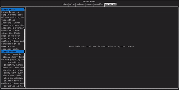
更详细的示例请参阅详细示例。段落还包括许多其他变体,如下所示:
namespace ftxui {
    Element paragraph(std::string text);
    Element paragraphAlignLeft(std::string text);
    Element paragraphAlignRight(std::string text);
    Element paragraphAlignCenter(std::string text);
    Element paragraphAlignJustify(std::string text);
}
边框
在元素周围添加边框。
代码:
border(text("元素"))终端输出:
┌──────┐
│元素  │
└──────┘
Note
您可以使用管道操作符实现相同的行为。
代码:
text("元素") | border边框还有多种样式,如下所示:
namespace ftxui {
    Element border(Element);
    Element borderLight(Element);
    Element borderHeavy(Element);
    Element borderDouble(Element);
    Element borderRounded(Element);
    Element borderEmpty(Element);
    Decorator borderStyled(BorderStyle);
    Decorator borderWith(Pixel);
}
窗口
ftxui::window 是一个带有额外标题的 ftxui::border。要在元素周围添加窗口,请将其包装并指定一个字符串作为标题。
代码:
window("窗口", text("元素"))终端输出:
┌窗口─┐
│元素 │
└─────┘
分隔符
显示垂直/水平线,以视觉上将容器的内容分成两部分。
代码:
border(
  hbox({
    text("左"),
    separator(),
    text("右")
  })
)
终端输出:
┌──┬──┐
│左│右│
└──┴──┘
分隔符有多种样式,如下所示:
namespace ftxui {
    Element separator(void);
    Element separatorLight();
    Element separatorHeavy();
    Element separatorDouble();
    Element separatorEmpty();
    Element separatorStyled(BorderStyle);
    Element separator(Pixel);
    Element separatorCharacter(std::string);
    Element separatorHSelector(float left,
                               float right,
                               Color background,
                               Color foreground);
    Element separatorVSelector(float up,
                               float down,
                               Color background,
                               Color foreground);
}
进度条
这是一个表示进度比例的视觉元素。
代码:
border(gauge(0.5))终端输出:
┌────────────────────────────────────────────────────────────────────────────┐
│██████████████████████████████████████                                      │
└────────────────────────────────────────────────────────────────────────────┘
进度条可以多种方向显示,如下所示:
namespace {
    Element gauge(float ratio);
    Element gaugeLeft(float ratio);
    Element gaugeRight(float ratio);
    Element gaugeUp(float ratio);
    Element gaugeDown(float ratio);
    Element gaugeDirection(float ratio, GaugeDirection);
}
图表
@htmlonly
@endhtmlonly
参见:
Element graph(GraphFunction);颜色
大多数终端控制台可以显示彩色文本和彩色背景。FTXUI 支持所有调色板:
Decorator color(Color);
Decorator bgcolor(Color);颜色图库:
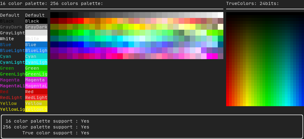
16色调色板
大多数终端支持以下颜色:
默认色
黑色
深灰色
浅灰色
白色
蓝色
亮蓝色
青色
亮青色
绿色
亮绿色
洋红色
亮洋红色
红色
亮红色
黄色
亮黄色
使用管道操作符应用上述颜色的示例:
text("蓝色前景") | color(Color::Blue);
text("蓝色背景") | bgcolor(Color::Blue);
text("黑底白字") | color(Color::Black) | bgcolor(Color::White);
256色调色板
支持256色的终端。 @htmlonly
@endhtmlonly
text("亮粉色") | color(Color::HotPink);真彩色
支持真彩色的终端,您可以直接使用24位RGB色彩空间:
使用以下构造函数指定颜色的RGB或HSV值:
有两个构造函数:
ftxui::Color::RGB(uint8_t red, uint8_t green, uint8_t blue);
ftxui::Color::HSV(uint8_t hue, uint8_t saturation, uint8_t value);
@htmlonly
@endhtmlonly
线性渐变
FTXUI 支持线性渐变。可应用于前景或背景。
Decorator color(const LinearGradient&);
Decorator bgcolor(const LinearGradient&);
ftxui::LinearGradient 由角度(度)和颜色停止点列表定义。
auto gradient = LinearGradient()
  .Angle(45)
  .AddStop(0.0, Color::Red)
  .AddStop(0.5, Color::Green)
  .AddStop(1.0, Color::Blue);
您也可以使用简化的构造函数:
LinearGradient(Color::Red, Color::Blue);LinearGradient(45, Color::Red, Color::Blue);参见演示。
样式
除了彩色文本和彩色背景外,许多终端还支持文本效果,例如:bold(粗体)、italic(斜体)、dim(暗淡)、underlined(下划线)、inverted(反色)、blink(闪烁)。
Element bold(Element);
Element italic(Element);
Element dim(Element);
Element inverted(Element);
Element underlined(Element);
Element underlinedDouble(Element);
Element strikethrough(Element);
Element blink(Element);
Decorator color(Color);
Decorator bgcolor(Color);
Decorator colorgrad(LinearGradient);
Decorator bgcolorgrad(LinearGradient);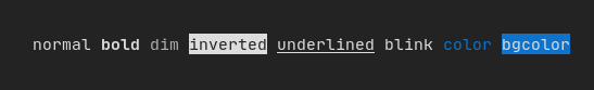
要使用这些效果,只需用所需的效果包装您的元素:
underlined(bold(text("此文本为粗体并带下划线")))或者,使用管道操作符将其链接到您的元素:
text("此文本为粗体") | bold | underlined布局
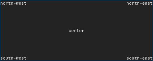
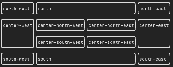
使元素能够以以下方式排列:
- 使用
ftxui::hbox水平排列 - 使用
ftxui::vbox垂直排列 - 使用
ftxui::gridbox在网格中排列 - 使用
ftxui::flexbox沿一个方向环绕排列。
使用 ftxui::hbox、ftxui::vbox 和 ftxui::filler 的示例。
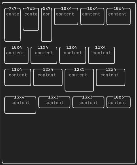
使用 ftxui::gridbox 的示例:
使用 flexbox 的示例:
元素也可以使用 ftxui::flex 装饰器变得灵活。
代码:
  hbox({
    text("左") | border ,
    text("中") | border | flex,
    text("右") | border,
  });
终端输出:
┌──┐┌─────────────────────────────────────────────────────┐┌───┐
│左││中                                                   ││右│
└──┘└─────────────────────────────────────────────────────┘└───┘
代码:
  hbox({
    text("左") | border ,
    text("中") | border | flex,
    text("右") | border | flex,
  });
终端输出:
┌──┐┌───────────────────────────────┐┌───────────────────────────────┐
│左││中 ││右 │
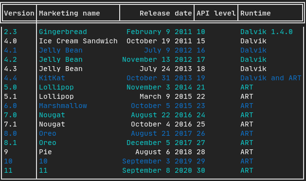
└──┘└───────────────────────────────┘└───────────────────────────────┘表格
能够轻松地将数据格式化为整洁的表格状视觉形式。
代码示例:
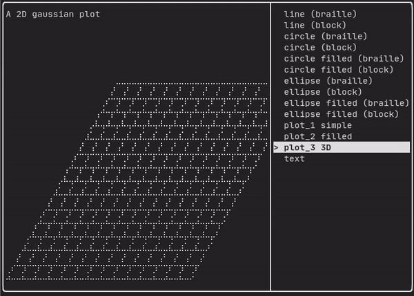
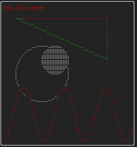
画布
参见 API <ftxui/dom/canvas.hpp>
  auto c = Canvas(100, 100);
  c.DrawPointLine(10, 10, 80, 10, Color::Red);
  auto element = canvas(c);
可以在 ftxui::Canvas 上使用盲文、方块或简单字符进行绘制:
简单示例:
复杂示例: